IBM - Cloud Pak System
IBM Cloud Pak System is a private cloud appliance that helps businesses build, deploy, and manage environments for all of their Red Hat OpenShift Container Platform and VMware based applications.
Timeframe: December 2019 - July 2020
IMPACT
Participated in 2 releases
Fostered close collaboration with engineers to ensure we’re delivering a polished product
THE PROBLEM
A design team has not been assigned to this product in over 5+ years.
Legacy product with an old UI. The UI has old visual styles and does not use any of IBM’s Design System, Carbon 10.
Content is outdated and needs to be updated with current industry terminology.
Our team was tasked to redesign the product using Carbon 10 while adding new features in.
Product is insanely massive - imagine having a cloud in a box. The system includes managing your own hardware.
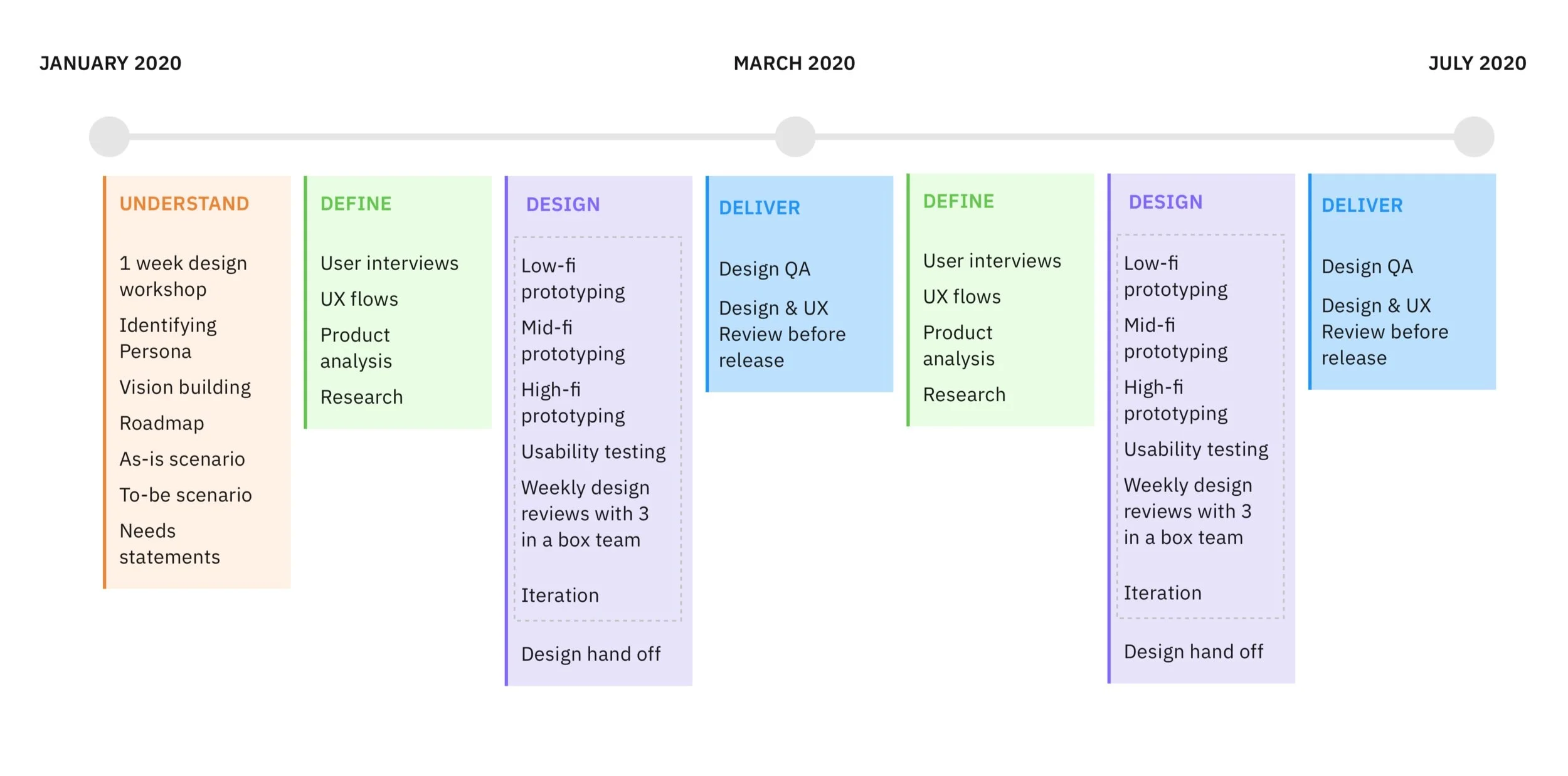
TIMELINE AND DESIGN PROCESS
PROVISION ENVIRONMENTS
In the legacy UI, users were giving a two column panel - one panel listing all the environments the user is able to deploy and another panel listing the details once the user has selected an environment.
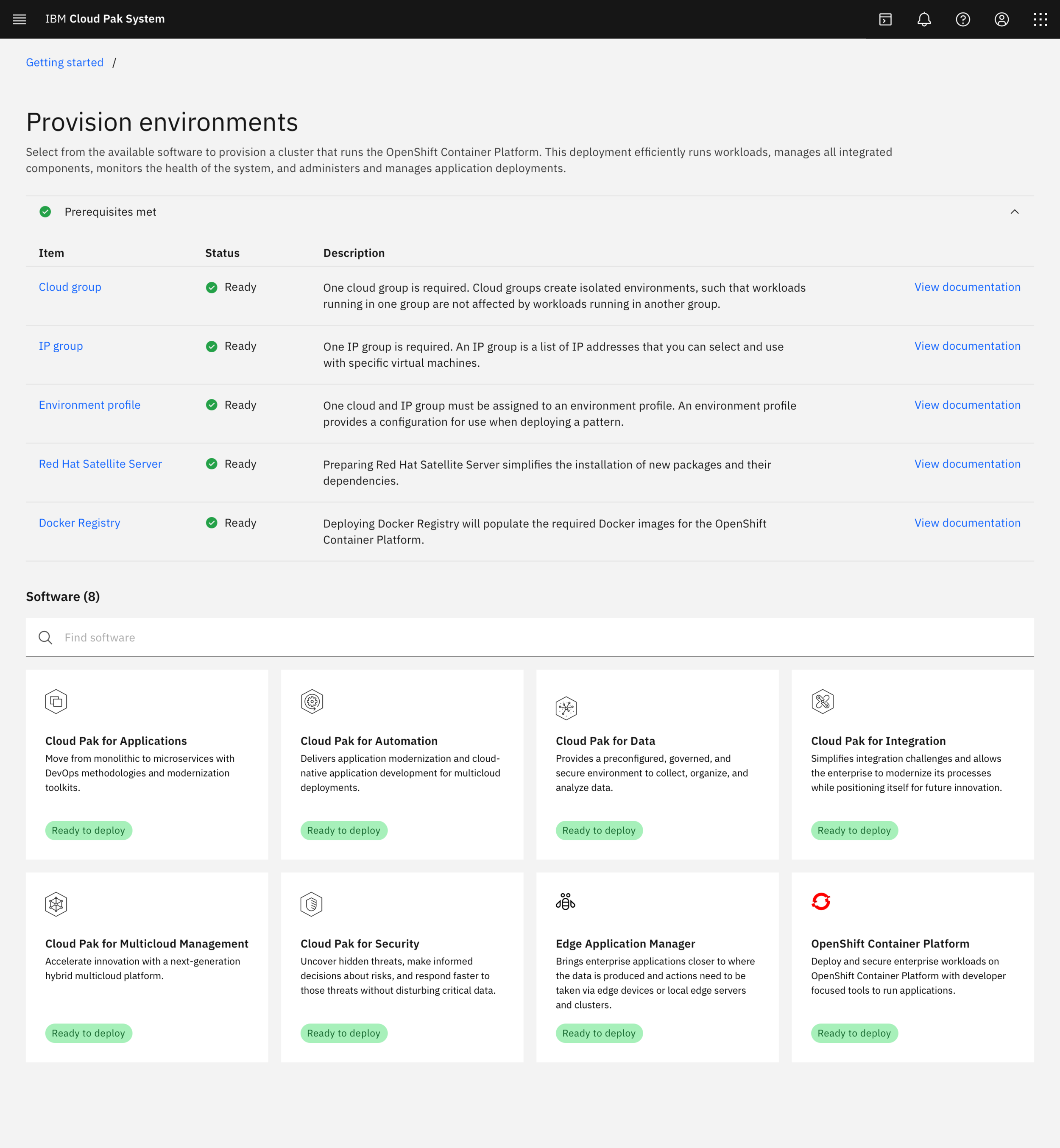
In the new design, I switched to using tiles and a sidebar for deployment. Using tiles allow for easy readability, a “catalog” like experience, and allows for quick selection.
BEFORE
AFTER
DEPLOY SCENARIO
The main use case of our product is to deploy a Cloud Pak software running on top of a Red Hat OpenShift Container Platform cluster. Deployment is a long, complicated process. Our goal is to make the process more linear and easier to understand.
BEFORE
AFTER
DESIGN ANALYSIS
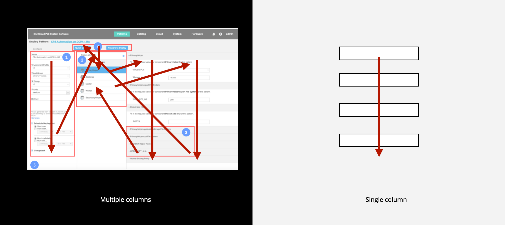
Currently, the form fields are laid out into multiple columns. Users will interpret and read the fields inconsistently – the user has to scan the page and complete the forms in a chaotic type of pattern. This slows the speed of comprehension and overall slowing down the user’s path of complete of the task.
We need to arrange the form columns in a way that the path of completion is easy. If you had a single column design, the path to complete is just straight down the page.
There are many pain points in the configure deployment page: we’re overloading the user with so much information, it can be overwhelming and users can easily make mistakes.
HOME PAGE REDESIGN
Our first iteration of the home page felt very “marketing” during user testing sessions. During our 2nd product release, we redesigned it based on user testing data to help our users take quick actions and get into productive use.
SYSTEM READINESS CHECK
One major problem that our users were running into was that they were allowed to go into the deployment process, fill in all the information, but their deployment of a cluster would fail due to missing prerequisites.
To help alleviate this problem, we added a quick prerequisite check on the provision environments page so users know what is needed and missing before proceeding to actually filling out information. I helped our users troubleshoot and save time from errors.
DESIGN Q&A
I lead the design QA process, kept track of the issues, and opened tickets for any design defects before the release. This was to ensure design quality.
My engineering team closed about 80% of the issues before the release.
CHALLENGES
Brand new design team – how does our team work best together
How to collaboratively work with others in Sketch
File management was disorganized
IF I HAD MORE TIME…
Hardware and infrastructure redesign
Use case: what happens when a user has filled out the configuration form, but exits out of the page? Is the information saved?
User testing - measure task and time completion of the scenario
WHAT I LEARNED
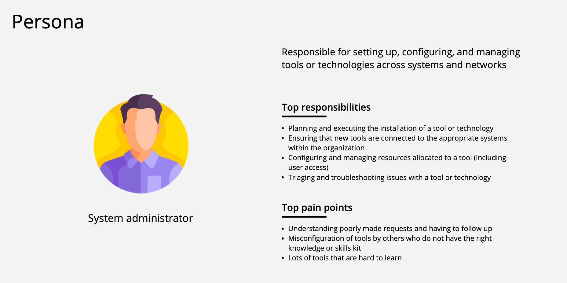
All technical things around Cloud – from deployment to managing their cluster, the administrator
1 week design workshop with entire team!
Being innovative and thinking of additional ways of elevating the user experience that isn’t really part of the PM requirements
Content design


