IBM - Cloud Pak Experiences
The IBM Cloud Pak Experiences team provides potential buyers and users with a hands-on experience that demonstrates the value of IBM Cloud Pak’s products. To build this onboarding experience, we use a third party tool called Appcues.
Timeframe: March 2019 - November 2019
ACCOMPLISHMENTS
Increased all flow completion rate by 10%
Our product team won a W3 Silver Award 2019 in the Visual Appeal and Website Experience categories
I received a Best Newcomer Award in September 2019 while on the team
Formal design review - user experience received a B
Increased the NPS from +20 to +56
Project led to a bigger effort where my team started building the best practices, patterns, and guidelines for onboarding tours that is now used across the Cloud organization
BEFORE
AFTER
THE PROBLEM
low flow completion rates
too much technical jargon used
value of product wasn’t stated clearly - a lot of questioning “why did I just do this?”
there needs to be a balance of content and action
NEW CONTENT Style Guideline
I worked with our content designer on the team and we updated our content style guideline. In our user experience, we rely heavily on content and the way we present it. The content is what the users interact with the most.
Our Findings:
Too much content tends to be ineffective
GIFs were too small to be helpful
Sometimes the GIFs took a lot of page space - blocking all other important information
Too much technical jargon - does our vocabulary match with the users?
No visibility of system status - users did not know where they were in the flow or what actions they were going to take next
MODALS
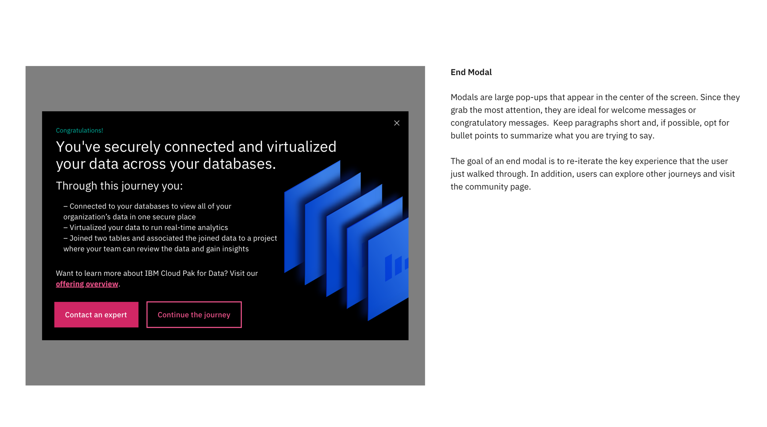
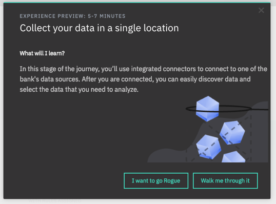
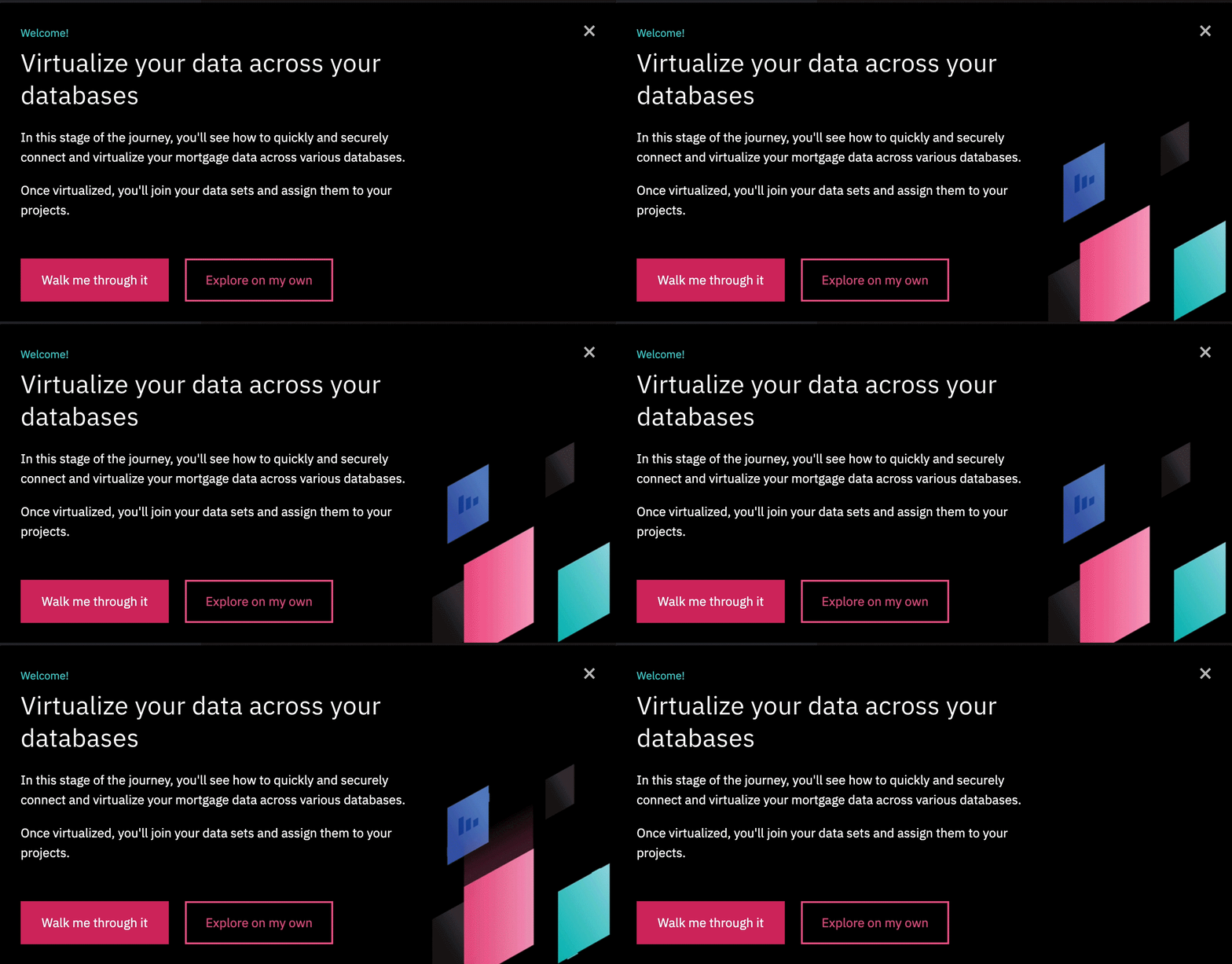
There are 3 different modals that we use on our experience: a welcome modal, a step completed modal, and an end modal.


SLIDEOUTS
Slideouts appear in the bottom-left corner of the screen with a backdrop. Slideouts are used to give the user more information about the purpose of the task and explains key values of the product.
Slideouts may include a header to help reduce the cognitive load on the content and to give a quick understanding to our users if they skim the content.
TOOLTIPS
Tooltips are small pop-ups attached to an element within the UI that guide the user through the experience. They appear sequentially to bring the user from one step to the next.
Instead of saying “Click Virtualize”, provide more context by saying “Virtualize your tables”.
INITIAL USER RESEARCH
Users were skeptical when they are told to download files from our product while going through the tour
Poorly placed tooltips were a significant source of user dissatisfaction
Users were just clicking around without understanding
The “value” and “wow moment” was not clearly communicated
PROCESS
Our old process of collaboration and working was not as effective as there was a lot of churn on what we wanted to show in our flows.
We improved our workflow by adding approval stages in between and more review sessions to improve our sync between all the different roles of the team.
WHAT I LEARNED
Design for content
Cross-organizational collaboration
Working with product and marketing to meet users expectations
Establishing clear guidelines to create consistency across all of our team products
If a currently workflow is not effective, try a new one
Working in agile and sprints
CHALLENGES
How might we create an easy, engaging demo that provides value?
Collaborating with big teams; most often remote and they all have different styles of collaborating
How do we bridge the gap between product and marketing?
Implementing with a 3rd party tool called Appcues
IF I HAD MORE TIME…
Create a low-fi animation GIFs for the tooltips that were difficult to explain in words


